Is Bitcoin a bubble?
Udgivet 2017-12-22 - Skrevet af Philip Sørensen

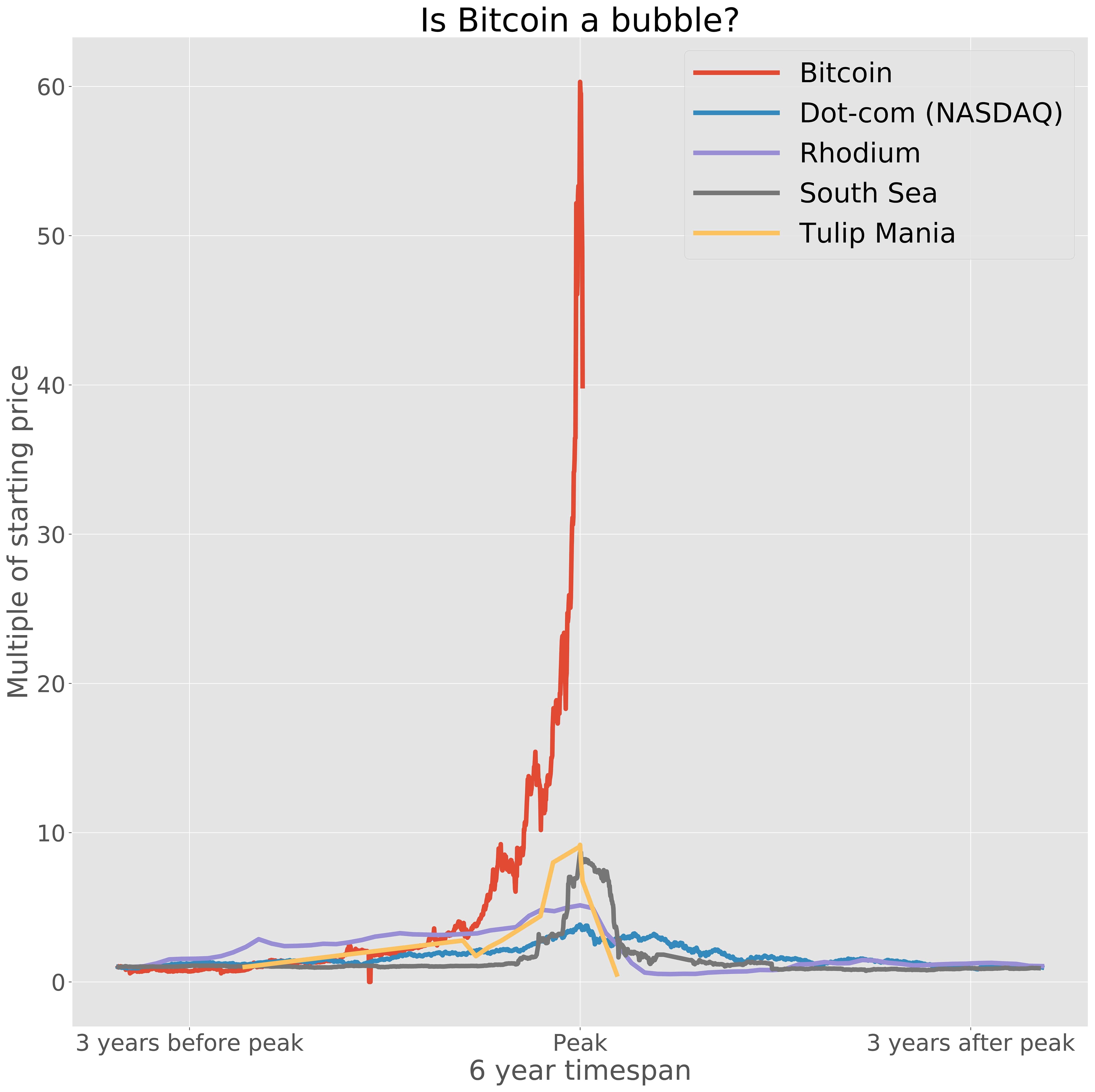
There has really been a frenzy for cryptocurrencies of late, and it has made people question whether or not it is a bubble. Looking at the graph above, I think we can all agree that cryptocurrency is definitely in the mania faze where it's getting really hyped up. So what I wanted to do was to compare it to other historical bubbles through time and see how it appears.
Historical bubbles
Before diving into some data, we need to find it first. Finding bubbles isn't hard, there are tons of examples through history where there were a frenzy and then a sudden drop. The hard part, however, is getting the actual price data. I managed to find data on these economical bubbles:The dot-com crash in 2000 is a recent bubble, as it happened around the millennium where investments were pouring into thousands of new internet companies. Many of these companies had risky policies of growth over profit, as their mindset was to rapidly built a customer base because the profits would surely follow. They didn't and the market crashed.
The Rhodium bubble in 2008 was a craze where a demand in the American car industry, a bullish market for rare metals, and rogue speculators on Wall Street rallied to create a spike in price for some reason.
The South Sea bubble was a speculative bubble in the early 18th century, involving the shares of a company called the South Sea Company. This was a British international trading firm that had monopoly on trade with Spain's colonies in South America and the West Indies. This was a time of wealth and abundance so investors flocked to get their share of the astronomical returns. After quickly reaching 10 times its value, the bubble burst and many were left penniless.
Tulip Mania in 1636 is a bizarre bubble, where certain varieties of tulips were worth more than a house. The demand for tulip grew exponentially meanwhile supply was low due to the fact it takes 4 to 7 years for tulips to flower and buyers were hoarding them. The over-inflated prices couldn't last long, and the price declined sharply within weeks.
Anyway, enough talk, let's explore the data.
Data juggling
Now for the fun part where we do something with the data. What I want to do is to load the data into a Pandas dataframe, where I can manipulate it.df = pd.read_csv('data/BTC USD Historical Data.csv')There are some missing values that we are not interested in, so they are removed. Furthermore, this dataset is reverse chronological order (latest prices at the top), so it's flipped. df = df.dropna()df = df.iloc[::-1]Let's convert the date string into a datetime.
def ConvertDate(row): return datetime.datetime.strptime(row['Date'], '%b %d, %Y')df['date'] = df.apply (lambda row: ConvertDate (row), axis = 1)Let's also convert the price into a float.
def ConvertPrice(row): return float(str(row['Price']).replace(",", ""))df['price'] = df.apply (lambda row: ConvertPrice (row), axis = 1)Now let's find the peak price and only look at data around it. I have found 3 years to be a decent value for the time leading up to and after the peak. DAYS = 3 * 365datePeak = df.at[df['price'].argmax(), 'date']dateStart = datePeak - datetime.timedelta(days = DAYS)dateEnd = datePeak + datetime.timedelta(days = DAYS)df = df[df['date'].between(dateStart, dateEnd, inclusive = True)]As we'll be seeing multiple bubbles on the same graph there needs to be a common Y-axis. To do this an initial price is found, where the rest of the prices are compared against.
priceInitial = df['price'].iloc[0]def AdjustPriceInitial(row, priceInitial): return row['price'] / priceInitialdf['price'] = df.apply (lambda row: AdjustPriceInitial (row, priceInitial), axis = 1)In order to also have a common X-axis I convert the dates according to the peak.
def AdjustDateToPeak(row, datePeak): return row['date'] - datePeakdf['date'] = df.apply (lambda row: AdjustDateToPeak (row, datePeak), axis = 1)All of the above code can be put into a function, and then adjusted according to the dataset being handled.
def GetBitcoinDf(DAYS = 3 * 365): df = pd.read_csv('data/BTC USD Historical Data.csv') df = df.dropna() df = df.iloc[::-1] def ConvertDate(row): return datetime.datetime.strptime(row['Date'], '%b %d, %Y') df['date'] = df.apply (lambda row: ConvertDate (row), axis = 1) def ConvertPrice(row): return float(str(row['Price']).replace(",", "")) df['price'] = df.apply (lambda row: ConvertPrice (row), axis = 1) datePeak = df.at[df['price'].argmax(), 'date'] dateStart = datePeak - datetime.timedelta(days = DAYS) dateEnd = datePeak + datetime.timedelta(days = DAYS) df = df[df['date'].between(dateStart, dateEnd, inclusive = True)] priceInitial = df['price'].iloc[0] def AdjustPriceInitial(row, priceInitial): return row['price'] / priceInitial df['price'] = df.apply (lambda row: AdjustPriceInitial (row, priceInitial), axis = 1) def AdjustDateToPeak(row, datePeak): return row['date'] - datePeak df['date'] = df.apply (lambda row: AdjustDateToPeak (row, datePeak), axis = 1) return df[['date'] + ['price']]Let's get visual
With dataframes of all the datasets gathered we can create a graph, like so:plt.figure(figsize = (20, 20))plt.plot(bitcoinDf['date'], bitcoinDf['price'], label = 'Bitcoin')plt.legend()plt.show()For the data I have gathered (Bitcoin updated 2017-12-21) I get the following graph.
 It is quite clear to see that there is definitely some unsustainable growth going on with Bitcoin which is already beginning to decline a bit, but it will be interesting to follow and see how it pans out. Once we get over the mania phase I believe interesting things will happen with cryptocurrency, just don't get caught on the hype train.